Design System
Why does RBCx need a design system?
RBCx faced challenges with efficiently updating its website. Small but important tasks, such as adjusting icons, updating colour schemes, and changing images, were unexpectedly time-consuming.
At the heart of this issue was the lack of a comprehensive design system or UI library, forcing designers to manually adjust every pixel of a specific piece for any update needed.

What I did
I worked as a member of the Strategic Design team with a senior designer to audit RBCx's existing website and develop a comprehensive design system, which included a UI component library.
My role
UI Designer
Visual Designer
Duration
4 Months
Deliverables
Design system
UI Component library
Hi-fi wireframes
Hi-fi prototype
Challenge
The unique challenge of this project stemmed from the fact that, unlike typical website development processes where a design system is established early on to streamline updates, this website had no pre-existing design system in place.
This "working backward" approach required the design team to carefully evaluate the current design from scratch—deciding what elements should be kept, altered, or eliminated.
Design goals
My goal was to componentize every element of the website's design—from containers to buttons to icons—ensuring they were organized into a logically structured variant set.
I also ensured all design specifications were updated to Figma's local variables and style library to make everything user-friendly and efficient, ensuring smooth updates and consistency throughout the website
Design process
01
Audit
The first step was a thorough audit of RBCx's website:
-
Cataloged every visual element, such as buttons, input fields, icons, and cards.
-
Identified inconsistencies and areas where the current design did not align with the visual identity.
-
Evaluated usability and readability, pinpointing areas for enhanced interaction and navigation.
02
Design tokens
Identified key design elements—colour, typography, spacing, and border-radius—into reusable tokens and variables. These design tokens ensure consistency across the website and streamline the design-to-development workflow.
03
UI component library
Using insights from the audit, a UI component library was developed. This involved designing reusable components for every identified element during the audit and organizing them into a structured variant set.
04
Implementation
By using Auto Layout and optimizing components for both mobile and desktop, it becomes easier to design a responsive UI that looks and functions well on all devices.
Design philosophies

Atomic design methodology
I have applied Atomic Design principles to develop a scalable design system. Beginning with atoms, I combine these into molecules and organisms, progressively creating more complex UI components, like building a Lego.
Using the Atomic Design Methodology can improve reusability and consistency across the design.
It simplifies maintenance and enhances the efficiency of the design process by enabling designers to assemble interfaces from a standardized set of components.


Component architecture
Atomic design allows me to build up from the simplest units (atoms) to more complicated structures (molecules and organisms), streamlining the design process.
This layered approach ensures consistency across the design, making it easier to scale and maintain while keeping the overall system organized and flexible.

Design specifications
I've highlighted the specifics for each UI element, like how much space is around them, where they line up, and edge details, showing the exact sizes needed to make them.
My goal is to make it easier for designers and developers to work together, keep things simple to take care of, and smoothly pass designs to the coding team.

Design token architecture
Working closely with developers, we set up a system of design tokens that use global and brand-specific colors for UI elements we build.
These tokens make it easier to change a company’s visual language across different products. This approach ensures design consistency, eases maintenance, and enables seamless design-to-code transitions.

Design highlights
Effortless variant switching with toggles
My approach to component design focuses on simplifying the process of switching variant states to merely toggling a button, allowing designers to edit text and adjust features directly without the need to dig into component details.


Make things easy to find
I have implemented a logical organization structure that includes a local styles library and a categorized collection of design tokens based on their hierarchy. I've grouped related components into themed sections within the asset library, enabling designers to quickly locate the resources they need.


Accessibility is the key
Good design is about making websites easy for everyone to use. By focusing on details, I am aiming to create an intuitive and inclusive experience, ensuring that every user can navigate with ease and confidence.
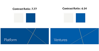
Aiming high with AAA in accessibility standards
We've improved our design to meet top accessibility standards by boosting colour contrasts, making everything clearer and easier to use for everyone.
Before

After
Make things obvious
In the updated design, the main content is now enclosed within a distinct border, creating a card-like appearance that stands out from the tab menu, making the interface more accessible and intuitive to navigate.
Before

After

They are clickable
In enhancing webpage accessibility, I ensure that all crucial elements exhibit a distinct hover state, showing their interactivity and making it visually evident for users to identify clickable components