


Overview
My teammate and I participated in the Adobe x Patagonia Creative Jam Challenge.
ONE is designed to build a community that supports ethical and sustainable fashion. Our goal is to empower individuals to support ethical companies by performing vetting for them.
There are three core pillars to ONE: enrich, empower, and inspire.
✨Award
We are very honoured to be the 5th place winner of Adobe Creative Jam + Patagonia Design Challenge!

Role
-
UX Research
-
Wireframe
-
Usability Testing
-
Prototyping
-
UI Style Tile
-
Motion Graphic Design
Project Type
Adobe + Patagonia Creative Jam Challenge
Team
Two Designers
Duration
One Week
Tools


Creative Brief
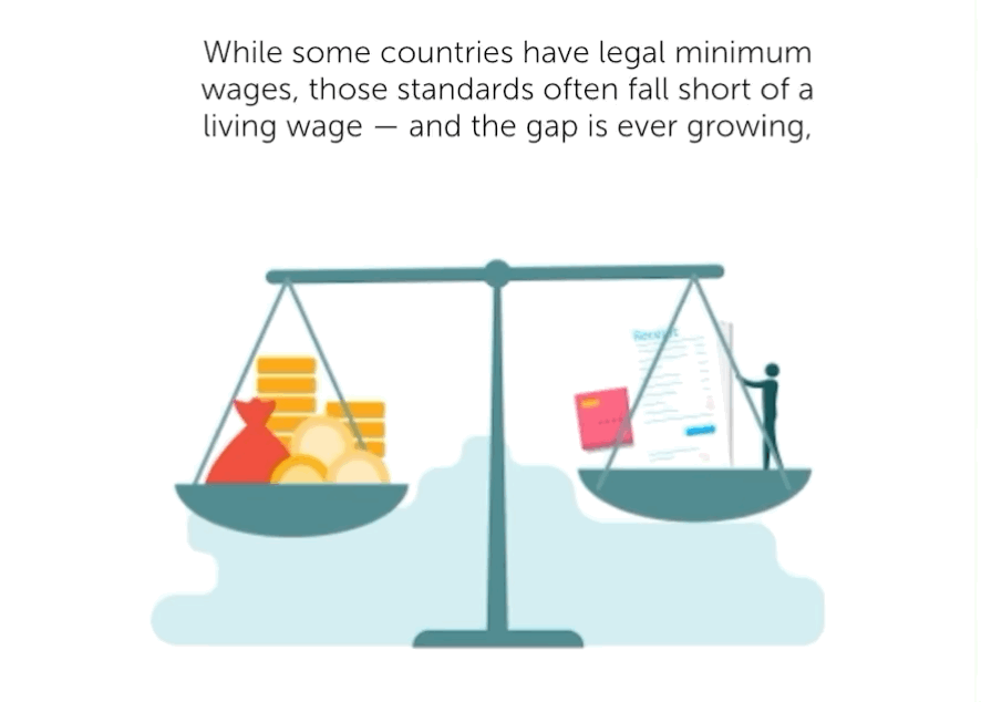
This was a one-week Adobe design jam, the challenge is to design a mobile app that informs a consumer segment about brands that support living wages directly benefitting workers and their families.
Several prompts that should include in the final production:
-
Educate customers on fair trade
-
Demand better supply chain practices
-
Encourage consumers to take action
-
Transparency in communities or factories where revenue is distributed
Challenage
The process of education is easy to let people feel bored. Therefore, reducing the boringness of reading content is one crucial key point for the design, we also want to ensure people can really consume the knowledge.
In addition, it is not hard to let people become aware of what we deliver, but HMW turn the awareness into long-term actions?
Before We Start
For purpose of delivering easily understandable content to users, we as designers should have a brief understanding of the fair trade, living wage movement, and all of the related ethical practices.
As result, we decided during the research phase, that we should put our focus more on secondary research instead of primary research.
Approach
For this project, my teammate and I used the Figma Jam to brainstorm and organize our research information. We organized our tasks into steps and used Trello to monitor every step.
We also communicate every day via a 2-hour zoom meeting work session, in order to exchange new ideas and solve technical problems.
Process Map
I used light bulb symbols to indicate the stages that were the most challenging.

💡
💡
💡
💡
Secondary Research
I went through online news articles, blogs, and social media to better understand the scope of the problem. Our main goals are:
-
Search on ethical brands and went through their websites, blogs, and social media to understand their aspects and approaches to sustainable, ethical fashion.
-
Gather reliable information about the living wage movement, including people's true stories about this movement and data about living wages in Canada.
$20.52
The 2021 living wage for Metro Vancouver is $20.52 per hour, a 5.2% increase over 2019, the report shows.
350
There are over 350 certified Living Wage Employers across BC in addressing poverty.
2500
There are approximately 2500 employees receiving living wages in the Metro Vancouver area.
User Research
Ethical shoppers are our main targeted interviewees. Through the interview, our goal is to understand why they get involved in the ethical movement. As a result, we arranged two one-on-one interviews with people who had acknowledgment about ethical fashion.
Below are questions we asked during the interview:
-
Where did you hear of the trend of ethical fashion?
-
Can you recall one or two ethical movements that you have heard of?
-
What are the main tools that you use to gain information on ethical movements and get to know ethical fashion brands?
-
Can you define if the clothing you brought is from an ethical brand? Why?
-
On a scale of 1-10, how hard is building a new habit for you? Why?
User Pain Points, Opportunities and Constraints
💡Opportunities
-
A place for consumers to browse ethical fashion brands.
-
Rewarded task system for users to accomplish.
-
A platform where ethical fashion brands can share information and connect with consumers.
-
Educating the general public on ethical movements via providing different quizzes.
🛑 Constraints
-
Time limitation.
-
The boringness of taking quizzes.
-
The amount of content.
-
Designing for accessbility.
User Persona
Jessie just started her new job at Sustainable Development Advisory Council. By doing this job, she got a chance to get in touch with more sustainable fashion brands and started caring more about the environment and the way of living. She is eager to learn more about ethical and sustainable fashion and wants to support and get involved in this movement.

Design Principles
By analyzing user research results, our group defined three main methods of ONE that we want to focus on.
LEARN
Let users improve their learning through monthly quizzes with different topics and comprehending their knowledge of ethical practices.
DISCOVER
Collected various brands for users to browse along with the latest updated news articles and blog posts about relevant topics and trends.
BUILD
Through the ongoing engagement with the featured challenge pledge system, users may form better habits to support ethical and sustainable development.
Main Features
Our group outlined key features based on the design principles of ONE.
QUIZS
New quizzes are deployed every month and are designed to educate and raise awareness surrounding ethical practices within the fashion industry.
DISCOVER
Explore different brands and stay up-to-date with various initiatives, trends, and movements.
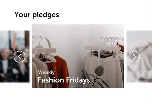
PLEDGES
Participate in a variety of pledges and join the ONE community in becoming a more ethical shopper.
User Flow
After we defined three main features for ONE, we created a user flow to help us build the mid-fi wireframes.

💡
💡
💡
💡
Mid-Fidelity Wireframes
We had two user tests on mid-fidelity wireframes to obtain insights regarding user flow and information architecture. Here are the flagging 🚩 we got through the test.
-
That "take a quiz banner" on the homepage is annoying
-
Need to improve the information hierarchy on the quick read and my impact page.
-
Information is overloaded and needs to simplify.
-
Icons on the right corner of the page have weak visibility and are less relevant to the product.
-
The certification progress needs visualization to improve user experiences.
To sum up, we need to improve the interface design, information hierarchy and user engagement experiences.

👎
👎
👎
Design System
With four vivid and contrasting colours, we want to create a simple and clean design that perfectly matches the characteristics and value behind this app.

Final Production
Learn
New quizzes are deployed every month and are designed to educate and raise awareness surrounding ethical practices within the fashion industry.

Discover
Explore different brands and stay up-to-date with various initiatives, trends, and movements. Learn about what they are doing to benefit their workers and communities.

Build
Participate in a variety of pledges and join the ONE community in becoming a more ethical shopper. Everyone has a responsibility to ensure businesses are participating in ethical manufacturing practices.

Featured Highlights
Improve user engagement with animations
Animated visuals can increase the chances of information retention, thereby enhancing long-term memory whilst increasing the engagement held within the educational quiz in order to make the experience more entertaining and enjoyable.

Interactive experience
By using interactive elements, users can have a more engaging experience. This helps to captivate user attention whilst encouraging exploration.

Human-centred design
Designing with accessibility in mind can enable individuals from all walks of life to perceive, understand, navigate, and interact with the app, and we strive to continually ensure that everyone is able to maintain equal access to this app.
(1) Different states of components
The dot and line underneath the icon allow users who have colour vision deficiency can also easily discern which page they have landed on.
(2) Voice command & Audio content
Audio content provided a alternative way for users to read the content.
Voice command integration allows for enhanced interaction with existing graphical interfaces more convenient for users.


Interact with ONE
You can also click the button down below👇🏻
Reflection
As a team, we had conquered numerous challenges throughout this contest project.
😣The first challenge we need to resolve existed at the very beginning user research phase. Because of the short amount of time we have, we didn’t have much time to find appropriate interviewees, so we decided to prioritize our tasks and put more effort into the secondary research. Consequently, we had a shortage in targeting accurate audiences.
🤪Another difficulty happened when I was trying to improve the education process to be more interactive and engaging. We got a lot of negative feedback during our user test on mid-fi wireframes. Participants complained that the content was overwhelming and hard to consume. I tried to resolve this issue by implying all possible resolutions that I can do. In the end, I decided to increase user engagement by using motion graphics. I challenged myself to self-learned Adobe After Effect in a very short time, and the result is remarkable🙌.
❤️Communication is the key to reaching teamwork success. Working with another person required alignment on shared processes and communications. The everyday 2-hour working session was particularly helpful as we can catch up on time about each other's progress and keep exchanging thoughts. Moreover, we can resolve technical difficulties quickly when they existed.
What Would I Change Or Do Differently?
-
Conduct more user interviews with efficient time management to profile our target audience.
-
Add AR camera feature to let users scan retail tags and search for fashion brands during offline shopping.
-
Improve the design of onboarding pages
-
Add a dark mode feature to provide a better reading experience in a dark environment.